A gallery wall can transform a blank stretch of wall into the most interesting part of a room. But the difference between a gallery wall that looks curated and one that looks cluttered comes down to one thing: planning. Learning how to plan a gallery wall properly means you never have to deal with a wall full of unnecessary nail holes.
Choose a Layout Style First
Before you touch a single frame, decide on your overall style, since this shapes every decision that follows.
A grid layout uses uniform rows and columns, best suited to same-size frames in matching finishes. It reads as clean and modern, and it’s the most beginner-friendly option since consistent spacing does most of the work for you.
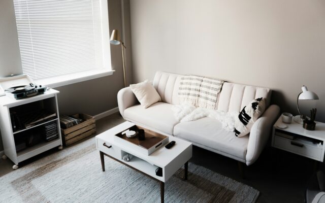
A symmetrical layout varies frame sizes but balances them around a central axis, often anchored by one larger piece. This style works especially well above a sofa or mantel.
Salon-style arrangements mix sizes and frame styles with looser spacing. They look effortless once finished, but they actually require more planning to feel cohesive rather than random.
Start With One Anchor Piece
Every successful gallery wall has one piece that acts as the anchor, usually the largest or most visually dominant item. This doesn’t mean it has to be massive. It just needs to stand out through size, color, or subject matter.
Build outward from this piece, balancing visual weight on each side as you add smaller frames. Trying to plan the whole wall at once, without a clear starting point, is one of the most common reasons people end up stuck before they even begin.
Use the Paper Template Method
This is the single most useful trick for anyone learning how to plan a gallery wall, and according to Crate & Barrel, it’s the standard approach professional designers rely on too.
Trace each frame onto kraft paper or newspaper, then cut out the shapes. Tape these paper templates to the wall in your planned arrangement using painter’s tape. This lets you test, move, and adjust the entire layout without making a single hole.
Once the arrangement looks right, mark where the hanging hardware sits on each paper template. These marks tell you exactly where to drive each nail, removing the guesswork entirely.
Live With the Paper Layout for a Day
Don’t rush from paper templates straight to nails. Step back at least eight feet, since adjustments made from two feet away almost always look different once you see the wall from across the room.
If possible, leave the paper templates up for a full day. Walk past the wall at different times, in different light, and see how it feels. Spacing that looked fine in the morning sometimes reads differently by evening light.
Get the Spacing Right
Uneven spacing is the most common reason a gallery wall looks accidental, even when the person who hung it can’t quite explain why it feels off. As a general rule, leave two to three inches between small and medium frames, and up to four inches for larger pieces.
The exact number matters less than consistency. A wall where every gap matches, even loosely, reads as intentional. A wall with wildly different gaps reads as thrown together.
Center the Arrangement at the Right Height
Standard gallery height positions the center of the arrangement at about 57 inches from the floor, roughly eye level for an average adult. This holds true whether you’re hanging above a sofa, in a hallway, or on an empty wall.
If your gallery wall sits above a piece of furniture, like a sofa or console, keep the entire arrangement within about two-thirds of the furniture’s width. A wall of frames that’s noticeably wider than the sofa beneath it tends to look unbalanced.
Hold One Element Constant
A gallery wall doesn’t need every frame to match, but it does need one consistent thread running through the whole arrangement. This can be color palette, frame finish, or subject matter.
Holding the frame color constant is usually the most forgiving option, since it lets photo subjects and sizes vary freely while still tying the whole wall together visually.
Avoid Buying Everything at Once
It’s tempting to buy a full set of frames and art in one trip, but a wall built entirely at once often looks purchased rather than collected. Start with your anchor piece and two or three supporting frames, then add outward over time.
This approach also gives you room to adjust the plan as you go, rather than committing to a full layout before you’ve seen anything on the actual wall.
The Takeaway
Knowing how to plan a gallery wall comes down to choosing a layout style, starting with one anchor piece, and testing everything with paper before a single nail goes in. The paper template method alone prevents almost every common gallery wall mistake.
Once your wall is planned, choosing curtains with the right length and fullness nearby helps frame the whole space, since window treatments and wall art both play a role in how finished a room ultimately feels.